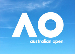
In October Tennis Australia unveiled a new dynamic brand identity for its flagship event – the Australian Open.
Developed with brand consultant and design agency Landor Australia, the new tournament identity aims not just to reinforce the Australian Open’s ‘reputation for delivering worlds class experiences to fans and players’, but also to enhance its status as Australia’s premier sporting event as an innovative entertainment brand that connects with new audiences.
Replacing its previous logo (an icon of a player serving against the sunset in a boxed holding shape), the new logo does away with any kind of tennis reference and focuses on the equity of the name as primarily expressed through two giant letters – ‘AO’.
This fresh new identity spanned the event logo and linked, abbreviated, easy to produce bold monogram activated in parallel geometric patterns.
The new work spans at-tournament assets on-site dressing, banners, flags and signage, as well as associated event pieces such as the official programme, OOH and posters, ads and promotional executions as well as digital content and social media banners.
The brand benefited from new fonts and typography, style guides, colour palettes and brand geometry.
The new look was unveiled to coincide with the launch of tickets sales for the 2017 tournament.
‘The Australian Open is renowned as one of the most innovative sports and entertainment events in the world. To ensure we optimise the many new media opportunities available now and in the future, we also needed to evolve our look and feel, make it more relevant globally and more adaptable in an increasingly digital world,’ explains Tennis Australia CEO Craig Tiley.
‘The result is a dynamic new look that will give us the flexibility to engage more deeply with our fans, partners and the players. It’s fresh, fun and often playful – just like the Australian Open itself.’
Innovation was a key strand of the brief and Dominic Walsh, Landor Australia managing director, explains that this meant an approach that ensured the brand was adaptable and future-facing.
‘While the brand needed to remain simple and recognisable, it also needed to be given the flexibility to be agile – adapting and responding to the environment,’ says Walsh.
‘We wanted to create a living system which could animate and move in accordance with the dynamic of the game itself. A bold, energetic and active identity to reflect this leading sporting experience that embodies Australia,’ adds Mike Staniford, executive creative director of Landor Australia.
‘The simplicity of the mark gives it the license to do almost anything. It’s not only a short hand to the Australian Open, it’s a mark that is a timeless icon that can be the vehicle of constant reinvention.’
Comment:
The new identity and its spectrum of assets were revealed in October, months ahead of the Australian Open 2017 – which will be held at Melbourne Park from 16 to 29 January.
First held way back in 1905, the Australian Open is one of the world’s four Major/Grand Slam tennis tournaments held annually every January in Melbourne (alongside the French Open, Wimbledon, and the US Open).
One of the Asia/Pacific region’s biggest annual sports events, more than 720,000 people attended this year’s tournament.
But we do have one question – does anyone actually refer to the tournament as the AO?
Links:
Tennis Australia/Australian Open
https://twitter.com/australianopen
https://www.instagram.com/australianopen/
https://www.facebook.com/AustralianOpen
http://sports.sina.com.cn/tennis/ausopen17/index.shtml
Landor Australia

