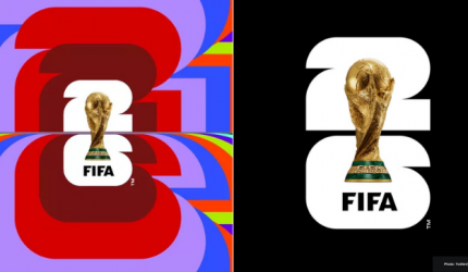
On 18 May, FIFA revealed its 2026 World Cup static logo, animated sequence, slogan and multi-market, multi-city ‘We Are 26’ campaign with an LA launch event, local initiatives and a central social media drop: a tournament jointly hosted by Canada, Mexico and the United States of America.
Initially unveiled through the football global governing body’s official Twitter account, the official logo for the 2026 next edition of the sporting world’s biggest event features the number ‘26’ represented vertically over a central image of the World Cup trophy.
The image came in response to the rights owner’s brief which was to create a flexible logo which could be adapted to 16 host cities and which could be tweaked by different colours and references linked to each hot country and city.
#WeAre26 pic.twitter.com/H1SyqypUYY
— FIFA World Cup (@FIFAWorldCup) May 18, 2023
An accompanying FIFA statement said: “For the first time in history, an image of the trophy and the year of the tournament are represented, forming an innovative design language that anchors the emblem for 2026 and beyond. The image of the trophy and the year allow for customization to reflect the uniqueness of each host, while building an identifiable brand structure for years to come.”
FIFA President Gianni Infantino added: “This is a moment where three countries and an entire continent are collectively saying: ‘We are united as one to welcome the world and deliver the greatest FIFA World Cup ever best and most inclusive in history’”.
As it evolves, the ‘We Are 26’ campaign will seek to ‘arouse emotion’ in the run-up to the 48-team tournament which will kick off in June 2026 and local hosts leveraged the logo launch with their own social content and events.
Comment
The reveal certainly sparked some controversy across social media: with some criticising it as being too simple and lacking overt link to the three host countries, while others praised it as timeless and versatile.
We will let you decide.


Leave a comment
You must be logged in to post a comment.