The last week of June saw the USA’s first-ever majority female-owned professional soccer team – Angel City Football Club (ACFC) – unveil its new identity ahead of the 2022 National Women’s Soccer League (NWSL) season.
The integrated video and image led launch campaign, which debuted on 30 June, revealed the new crest via a multi-layered global English and Spanish marketing campaign that spans PR, social, digital, mobile, team merchandise, billboards and out-of-home visuals wrapping LA metro trains and a live show hosted by ACFC Founder Natalie Portman.
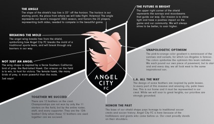
The work introduced the club’s new logo which was inspired by Los Angeles’ ‘city of angels’ nickname and by its memorable pink sunsets and features a dusty pink angel with wings outstretched taking flight against a monochrome background.
The organization asked eight different local artists to help it create an all-new iconic design featuring the team’s official colours – Armour, Sol Rosa and Asphalt.
Other identity details range from and upwards slope behind the ascending angel set at a 22 degree angle in celebration of the team’s inaugural 2022 season and the tip of the angel’s wings breaking through the shield indicates the team’s willingness to break the mould. 11 feathers represent the starting players while a 12th indicates the supporters, conveying both the uniqueness of the team as well as the overriding message that “we succeed together.
The unveiling was spearheaded by a rousing two-minute anthem video called ‘Our House: Our Anthem’ based around the idea that ‘Now’s the time to soar to new heights. This is our true identity, our crest. ¡Volemos!’
The hero spot was supported by another pair of online videos: a teaser style ‘Something Big Is Coming’ spot and an explanatory ‘Created with Purpose: The Story Behind Our Crest’ film.
While a further supporting spot called ‘LA All the Way’ showcases community reactions to the team.
The work aims to drive awareness around club, excitement ahead of the new season and seeks to boost its social media following.
“We stand on the shoulders of giants, forging a path of change, impact and excellence,” said ACFC Marketing Head Kayla Green. “Our brand identity and crest are representative of everything we believe in. They are a visual reminder to the world that we must never stop challenging the status quo in our unwavering pursuit of equity.”
“In this great city known for its endless sunsets and legendary stars, our visual identity had to pay homage to these important Los Angeles symbols, yet also signal what Angel City stands for—a more equitable future for all,” added ACFC Founder and President Julie Uhrman in the identity campaign launch statement.
Comment:
The pre-season 2021 identity launch followed in the footsteps of the club first marketing in July 2020 led by a hero spot called ‘We Are Angel City: Welcome to the Beginning’.














Leave a comment
You must be logged in to post a comment.