Late November saw Formula One (F1) launch a new brand identity as new owners Liberty Media seek to re-engage its global fanbase.
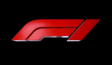
The brand refresh is spearheaded by a new logo, developed by Wieden + Kennedy London, which was unveiled via an integrated campaign leveraging the last race of the season – at Abu Dhabi’s Yas Marina Circuit – led by a spot titled ‘A New Era Awaits’.
The new logo is composed of three red lines forming an F and a 1 and is described by the rights-holder as ‘modern-retro’
It has been designed to emulate the shape and movement of a racing car and the bends of a racetrack.
The project, which was headed up with a W+K team led by Richard Turley, includes the new logo and a suite of typefaces that look to the simultaneously reflect heritage of the sport while also driving it forward
“The new mark aims to embody the core forces of Formula 1 racing: speed, attack, and control; while its sleek, sharp interlocking components celebrate the technical prowess of Formula 1 engineering teams,” commented Turley.
“Its aesthetic is aspirational and leans into the future, but extends naturally from a rich heritage of motorsport graphics.”
The rebrand project came after research, by agency Famingo, surveying F1 fans around the globe.
This study found that people engaged more with the personality-driven side of the sport, rather than its technical and business-driven aspects.
“When we talked to fans about what made Formula One amazing, what we heard was people loved the real, exhilarating, unpredictable and incomprehensibly fast elements of the sport,” said Ellie Norman, Formula One’s marketing director.
“It was about racing, but many felt those days were behind us and that the sport has become almost impenetrable for fans, particularly new ones. What we say and do now is so important for our future, but it must always be driven by our fans. They come first.”
Comment:
The new identity’s objective is both to cement a year of major changes for F1 as it hopes to re-engage its global fanbase: reaching out to a broader demographic group by positioning the sport as more open, more inclusive and establishing itself as a global media and entertainment brand.
Amidst the flurry of F1 changes since Liberty Media brought the property in January 2017 – which also include live entertainment events and city fan zones – this brand refresh is the auto racing series first brand overhaul in almost 20 years.
The updated emblem replaces its 23-year-old predecessor: a design created by design studio Carter Wong back in 1994.
Links:
Formula One:
https://www.facebook.com/Formula1
Wieden + Kennedy London

