The start of September saw the Local Organising Committee for the Olympic and Paralympic Games Los Angeles 2028 roll out a creative, diverse and flexible logo spearheading a story-led promotional campaign for LA28 Reveals.
The logo design set out to be representative of the digital age and is thus not only animated, but will evolve over time to reflect of the city’s spirit and its evolving and associated stories.
The multi-channel unveiling of the games’ official emblem was accompanied by a series of star stories celebrating sport, art, culture and the city’s unique community.
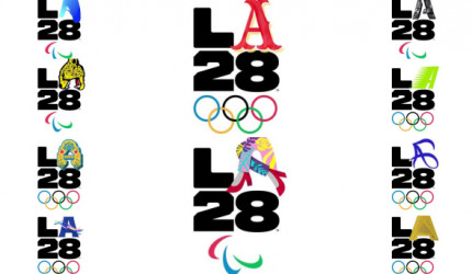
With creativity and evolution at the heart of the approach, the logo aims to express that no single, static graphic or illustration can express all that Los Angeles and the Games represents, so instead a strong and long line-up of athletes, artists and city advocates collaborated as ‘LA28 Creators’ in developing a changeable, evolving LA28 emblem which can be used to bring a wide range of personal stories to life through various individual interpretations of LA.
At the core of the campaign was the reveal of a constantly morphing emblem. An ever-shifting Olympic logo consisting of four key elements – the letters ‘L’ and ‘A’ (for Los Angeles) and the numerals 28 (representing the year of the Games) along with the iconic Olympic rings. But while the ‘L’ and ‘28’ remain constant, the ‘A’ is flexible and adaptable to innumerable changes to representing and reflect the wide diaspora of people, personalities and styles of the city.
The campaign and logo was unveiled at an official PR launch event and shared through a collection of stories across the LA28 social media channels and on the new LA28.org website.
The image was first introduced via a tweet posted on 1 September and backed up by matching logo reveal posts on Facebook and Instagram
We are a community of inspired individuals and fearless dreamers. It’s time we made our mark. #LA28 #LA28Creator pic.twitter.com/XagKkA5d9a
— LA28 (@LA28) September 1, 2020
These were followed by a ‘Welcome To LA’ logo-led video on the organisation’s official YouTube channel (which came in multiple language and subtitle formats including Chinese, French, Japanese, Spanish, Korean and Vietnamese)
It was then brought to life by a star-studded team of LA28 Creators who each created their own ‘A’s and unveiled these alongside individual social videos which ran on their own channels as well as on the official LA28 platforms and was introduced through a ‘Meet The LA28 Creators’ social spot.
Creators who have shared their LA stories include Olympians Adam Rippon (figure skating), Alex Morgan (football), Chloe Kim (snowboard), Gabby Douglas (gymnastics), Ibtihaj Muhammad (fencing), Simone Manuel (swimming), Allyson Felix and Michael Johnson (both athletics). Joining them are Paralympians Lex Gillette and Scout Bassett (both athletics) and Oz Sanchez (cycling), as well as Olympic and Paralympic hopefuls Jamal Hill (swimming), Chantel Navarro (boxing) and Ezra Frech (athletics). Celebrities Billie Eilish (singer-songwriter), Reese Witherspoon (actress, producer and entrepreneur), Lilly Singh (storyteller), Alex Israel (multimedia artist, writer and designer), Bobby Hundreds (illustrator and designer), Steven Harrington (multimedia artist) and Lauren “Lolo” Spencer (disability lifestyle model and actress) have also contributed, alongside members of the local community – Aidan Kosaka (community leader), Chaz Bojórquez (graffiti artist), Dr Woo (tattoo artist), Jorge “El Joy” Alvarez (chef) and Rachel Sumekh (social justice leader).
Johnson’s all-gold ‘A’ is a testament to his own four Olympic gold medals, while Felix’s logo was inspired by her Los Angeles roots and
The Olympic & Paralympic Games are coming home. My sanctuary, the city that raised me – Los Angeles Today the @LA28 Games are fueling a co-creation movement by sharing their platform to power so many unique stories. Excited to share my story today! #LA28Creator #LA28 pic.twitter.com/CX3DpyLXlN
— Allyson Felix (@allysonfelix) September 1, 2020
The logo and associated campaign primarily targets Gen Z and Millennials (who represent the Games’ ‘demographic sweet spot’ and was developed in harness with several creative partners and agencies including the LA-based Works Collective, Stink Studios, Media Monks, Cashmere Agency and Giant Spoon, as well as Nike’s design team.
“While our target is anyone who defines themselves as Olympic fans, we also wanted to foster a deeper connection with the audience who will be in their 20s and 30s when the games happen,” said LA28 Chief Marketing Officer Amy Gleeson.
“In light of the social conflict that’s transpiring in the world today, the new logo also serves as a vessel through which the games can amplify diverse voices, including those of its athletes. There’s a lot happening right now and we felt it was important to be part of the conversation and the solution. We have a global platform to bring to life who we are and what we stand for as being an anti-racist organization.”
“Los Angeles defies a singular identity, and there’s not one way to represent LA,” added LA28 Chief Athlete Officer and five-time Olympic medalist Janet Evans at the PR launch event.
“LA is what it is because of the people and the LA28 Games should represent that. The best way to capture the energy of Los Angeles and the Games is through a collection of voices. Los Angeles is an infinite canvas to pursue your wildest dreams and in 2028, thousands of Paralympians and Olympians will come to LA to chase their dreams on the global stage.”
“You can make your own,” LA28 chairperson Casey Wasserman said. “There’s not one way to represent Los Angeles, and there is strength in our diverse cultures. We have to represent the creativity and imagination of Los Angeles, the diversity of our community and the big dreams the Olympic and Paralympic Games provide.”
Outcome:
The tweet generated 120k views in the first 24 hours since it was posted on 1 September, with a further 28k views of subsequent logo reveal posts on Facebook and 35k Instagram, plus 146k views of the YouTube video.
Comment:
While some will argue that this Olympic logo is unlike any other in Games history, there are clearly links to the London 2012 logo which was the first Olympic emblem to be designed for the digital era.
The ever-changing new emblem succeeds the angelic bid logo unveiled in February 2016 when the city was bidding for the 2024 Games which was paired with the ‘Follow the Sun’ slogan.
.@72andSunny creates uplifting angel logo for L.A.'s Olympics bid @LA2024 https://t.co/uvOFisLUTQ pic.twitter.com/73fRSsf50J
— Ad Age (@adage) February 18, 2016
It was back in July 2017, that the IOC made a historic double awarding of the Olympics and Paralympics – to Paris for 2024 and Los Angeles for 2028. A decision which saw Paris and LA join London as the only cities to host the Olympics three times.
The process to create the emblem reportedly began around 18 months ago and the decision to go an infinite options idea was based around a need to stay relevant for the next eight years (as, Olympic host cities don’t usually have such a long lead-in time).
Interestingly, this isn’t the first time we’ve seen a dynamic logo represent LA. In 2017, agency 72andSunny created the ‘LA Original’ campaign for the city to highlight its various makers and manufacturers and its logo was a stretched-out LA that framed ever-changing images and artwork of the City of Angels’ diverse community of creators.
Links:
LA28
https://www.facebook.com/la2028
Works Collective
Stink Studios
Media Monks
Cashmere Agency
Giant Spoon
72andSunny
IOC/Olympic Games
https://www.olympic.org/the-ioc
https://www.facebook.com/olympics
https://www.instagram.com/olympics/
https://www.youtube.com/user/olympic















Leave a comment
You must be logged in to post a comment.