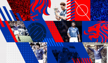
8 July saw Rangers FC roll out a brand refresh, labelled ‘READY’, spanning its club-wide visual assets ranging from its crest and typeface to its mobile and digital platforms.
Described as a brand evolution, the reworked branding launched alongside the key pillars in the club’s digital transformation project including a new website and app and aims to help the club’s global expansion strategy.
Developed with Scottish creative agency See Saw, the Rangers rebranding is led by the new Rangers READY crest (evolving the 1959 original and redesigned to add balance, power and a stronger presence to the brand) which introduces a new club visual language adapted for the digital era which includes a custom typeface and a re-energised colour palate.
This is just one of the club’s two crests and its original ‘scroll crest’ will remain unchanged on the team kit, while the new READY crest will run across all club branding and communications.
As well as a major PR push, the brand refresh was launched through illuminations across Glasgow with the new identity and crest projected across some of the city and club’s most iconic locations such as Ibrox Stadium, the Glasgow City Chambers and Kelvingrove.
The launch campaign also included multiple content pieces rolled out socially.
This digital marketing strand, developed with agency We Are Social who worked with Rangers to create a suite of online assets that tell the story of the club’s crest over the years.
Launched on 8 July, the campaign spanned a set of social content pieces
An inside look at how the Rangers ready crest has evolved #RangersReady
Go check out your new club website: https://t.co/gOwDjobecr pic.twitter.com/tIRRZjoH1h
— Rangers Football Club (@RangersFC) July 8, 2020
Among these assets is a 60-second ‘Rangers Ready’ film, produced by the internal design team, which is live on the club’s YouTube, Facebook and Instagram channels.
This was supported by further videos including ‘Crest Morph’ and the longer form ‘Brand Evolution’ film.
James Bisgrove, Rangers’ Director of Commercial and Marketing Rangers FC said: “This evolution of our brand identity is underpinned by our rich heritage and aspirational mindset, all of which will provide us a springboard to grow global audiences and, ultimately, drive greater commercial revenues.”
“We have retained, restored and re-energised the original visual elements in order to make a transformative impact whilst remaining true to the club’s historic brand values that encompass historic and pioneering elements” added See Saw Director Cameron Syme.
According to See saw Creative Director Maurice Hynds, the agency briefed to modernise its visual style for a global digital audience, while holding true to its heritage.
The creation of a new crest and a multi-platform redesign – spanning all of the club’s assets from office stationary and stadium signage through to marketing and the shirt typeface – was guided by heritage, character and vision.
Comment:
Founded in 1872, the brand refresh comes ahead of next year’s 150-year celebrations which will also see the club enact a digital transformation strategy to support global growth and fan engagement ambitions.
Links:
Rangers FC
https://www.youtube.com/RangersFC
https://www.facebook.com/rangersfc/
https://www.instagram.com/RangersFC/
See Saw
We Are Social










Leave a comment
You must be logged in to post a comment.